What Is the 70/30 Rule in Art?
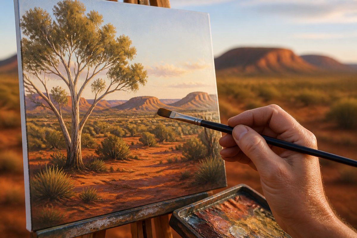
The 70/30 rule in art is a rule of thumb that suggests dividing a composition so that roughly 70 per cent is given to one dominant element, such as a main colour, tone or area, and about 30 per cent to a contrasting or supporting element. It's not a formal law, and no single authority defines it.
Artists, designers and teachers use it as a quick way to avoid the flat, evenly weighted look that comes from splitting everything fifty-fifty. This guide covers where the idea fits, how it works in practice and when to ignore it.
Because the rule is informal, you'll see it described a little differently depending on the context. A painter may mean colour proportions. A photographer may mean how much of the frame is sky and how much is land. An interior stylist may mean how much of a room is a calm base and how much is accent.
The common thread is the same. Unequal proportions create interest. Equal proportions tend to create tension or stillness without direction.
The Core Idea: Unequal Balance on Purpose
Look at almost any image that feels settled but not dull, and you'll often find an imbalance that someone has managed with care. One part leads. Another part answers. If both parts compete for equal attention, the eye doesn't know where to rest. If one part takes everything, the image can feel one-note.
The 70/30 split sits between those extremes. It gives the viewer a clear "main voice" and a "second voice" that adds contrast. That second voice can be a colour, a texture, a shape, a lit area against a shadowed one, or an empty region against a busy one.
Remember that 70/30 is an approximation. Nobody grabs a ruler to check that a blue wash covers exactly seven-tenths of a canvas. The numbers describe a feeling of clear dominance with a meaningful counterpoint. Anything near that ratio, such as 65/35 or 75/25, usually gives the same effect.
Where the Number Comes From
There's no famous painter or manifesto behind the 70/30 rule. It looks like a practical shortcut that grew out of older ideas about proportion and emphasis. Artists have long worked with ratios that avoid symmetry, and teachers often boil those ideas down to easy numbers so beginners can use them fast.
People often compare it with the Pareto principle, the observation that a large share of outcomes comes from a smaller share of causes, usually quoted as 80/20. That idea comes from economics and is tied to a pattern called the Pareto distribution, where a few items carry most of the weight.
Art isn't economics, and the 70/30 rule isn't a statistical law. Still, the comparison is a handy way to think. In a strong composition, a minority of elements usually does a disproportionate amount of the work in drawing the eye.
Applying It to Colour
Colour is the most common place to meet the rule. A palette with a dominant hue covering about 70 per cent of the surface and a second hue covering about 30 per cent tends to feel cohesive. Add a small accent and the picture gains a point of focus.
Picture a landscape where warm ochres and browns fill most of the canvas. A band of cool blue sky across roughly a third of the picture gives the warm tones something to push against. Flip it and you get a seascape dominated by blues, with warm sand or a distant glow for contrast.
In both cases, colour balance comes from letting one temperature lead while the other keeps it honest.
A few practical points help:
- Choose the leader first. Decide which hue or value family will carry the image before you mix anything else.
- Make the 30 per cent distinct. If the supporting area is too close to the dominant one, the contrast disappears and the rule does nothing.
- Vary saturation, not only hue. A quiet, muted 70 per cent can make a saturated 30 per cent glow.
- Keep accents small. A tiny patch of intense colour often works inside the 30 per cent region and doesn't need its own share.
Applying It to Composition
Beyond colour, the rule can describe how a picture is laid out. Place a horizon so the sky takes up about 70 per cent of the frame and the image feels open and airy. Place it so the land takes 70 per cent and it feels grounded and heavy. Put the horizon dead centre and it usually feels static, which is why many people avoid it unless they want that effect.
This is closely tied to the rule of thirds, which divides an image into a three by three grid and encourages placing key features along the lines or at their crossing points. A horizon on a thirds line gives something close to a 67/33 split, so the two guidelines often agree.
They're cousins, not twins. The rule of thirds is about where to place points and lines. The 70/30 rule is about how much area each part gets.
Some artists also reach for the golden ratio, a proportion of about 1.618 to 1, which divides a length into roughly 62 and 38 per cent. It's not far from 70/30 in spirit. The golden ratio is a specific mathematical relationship, while 70/30 is a looser, easier shorthand. Neither guarantees a good picture. Treat both as starting points, not requirements.
Negative Space and the Quiet 30
One of the best ways to use the rule is to give the "30" to empty or restful areas. Negative space, the unoccupied area around and between subjects, isn't wasted room. It lets the subject breathe and gives the eye a place to pause.
A still life with objects clustered in about 70 per cent of the frame and calm, open surface in the rest often reads as confident and uncluttered. A portrait with the figure off-centre and generous space on one side can suggest thought or distance.
Fill every corner and the picture may feel busy. No single part gets the attention it deserves.
The reverse works too. A mostly empty canvas with a tight cluster of detail can use the 70 per cent as quiet space, letting a smaller, richer area carry the story.
Building Visual Hierarchy
Visual hierarchy is the order in which a viewer notices things. The 70/30 rule is one of the simplest tools for building it. When one region clearly dominates, the eye starts there. The contrasting region becomes the second stop, and smaller details come third.
You can strengthen the hierarchy in several ways beyond area alone:
- Contrast in value. The lightest light and darkest dark usually grab attention first, so place them where you want the viewer to look.
- Contrast in detail. A crisp, textured area stands out against a soft, simple one.
- Contrast in size. A large shape ranks above a small one, as long as the small one isn't far more vivid.
- Contrast in position. Placement near a thirds line or a natural focal point adds weight.
If your painting feels confusing, check whether you've given two areas equal weight. It's a quick diagnosis. Often a small shift toward 70/30 clears things up.
Does the Rule Work for Abstract Art?
Abstract art has no recognisable subject to anchor the eye, so proportion and balance carry even more of the load. Many abstract painters rely on unequal divisions of colour, shape and texture to build tension and rhythm. A field of deep colour with a smaller, contrasting form can feel alive without any real-world content.
That said, abstraction is also where the rule gets broken on purpose most often. Colour field painters sometimes aim for near-total dominance of a single hue. Other artists build even, all-over compositions to remove any hierarchy.
Treat 70/30 as one option in a toolkit. It helps when you want a clear reading. It's unnecessary when you want uniformity or deliberate ambiguity.
Borrowing the Idea in Interior Design
Outside the studio, the same idea shows up in interior design, where people use it to plan a room. A typical version gives about 70 per cent of a space to a calm base, such as walls, large furniture and flooring. The other 30 per cent goes to contrasting or expressive pieces like cushions, art, rugs and lighting. Some designers stretch this into a 60/30/10 split to add a small accent.
That's a styling habit, not a rule of art history. But it shows how portable the idea is. If you're choosing artwork for a room, the same thinking applies.
A bold picture can be the 30 per cent that gives a neutral space character. Or a quieter piece can sit in a lively room and let the surroundings lead. Pick a work that echoes the room's main tones while adding a contrasting one, and the whole space feels considered.
A Simple Way to Test Your Own Work
You don't need a calculator to check proportions. These quick tests are enough for most situations:
- Squint test. Half-close your eyes and look at the picture. The large masses of tone and colour should become obvious. Can you spot a clear leader and a clear counterpoint?
- Greyscale test. Photograph the work and convert it to black and white. If everything turns the same mid-grey, the values may be too evenly spread.
- Thumbnail test. Shrink the image to a small size. Strong proportions survive shrinking. Weak ones turn to mush.
- Crop test. Hold two pieces of paper over the edges to change the framing. Notice how moving a boundary shifts the balance from awkward to settled.
These checks work just as well while you plan. Sketch a few small thumbnails with different splits, such as 50/50, 70/30 and 80/20. Compare how each feels before you commit to the larger work.
When to Break the Rule
The rule is useful because it's simple, but simple has limits. There are plenty of good reasons to set it aside:
- Symmetry is the point. Formal, ceremonial or meditative works often use an even split on purpose.
- Intensity is the point. A single dominant colour covering almost the whole canvas can feel overwhelming, in a good way.
- Complexity is the point. Busy, crowded compositions, such as dense narrative paintings, deliberately avoid a single dominant region.
- The subject demands it. Some scenes just look right with the proportions they naturally have.
Knowing the guideline turns breaking it into a choice, not an accident. Many experienced artists absorb proportional thinking so deeply that they stop counting percentages. They simply sense when something is out of balance.
Common Misunderstandings
Several mistakes come up again and again when people first learn the idea.
Treating it as a measurement. The ratio is a mental model, not a template to trace. A picture can feel like 70/30 without matching the figures exactly.
Confusing it with the Pareto principle. The 80/20 pattern describes how outcomes are spread in economics and other fields. It inspires the way artists think about emphasis, but it isn't the source of the art guideline.
Assuming it applies to every element at once. You can use it for colour, for space or for value. Forcing every part of an image into the same ratio can make the result look mechanical.
Applying it without contrast. A 70/30 split between two very similar colours or tones is hardly a split at all. The supporting area needs enough difference to matter.
Putting It Into Practice
If you want to try the approach, start small. Pick a subject you know well, such as a bowl of fruit, a view from your window or a simple abstract arrangement. Choose a dominant colour family and a contrasting one before you begin.
Block in the main areas first. Step back. Ask whether the proportions give a clear lead and a clear reply. Adjust early, since large areas are far easier to change at the start than at the end.
Looking at other work helps too. Visit a gallery or browse a local exhibition and try to name the dominant element in each piece, then the counterpoint. You'll probably find that many successful works follow this pattern, and that the exceptions are interesting for how they depart from it. For ideas about what's worth seeing around the region, Sunraysia Arts Guide is an independent editorial resource that covers the local arts scene.
Bottom Line
The 70/30 rule is a flexible, informal guideline that favours one clear lead and one meaningful counterpoint over an even split. It works for colour, composition, value and space. It overlaps with ideas like the rule of thirds and the golden ratio, and it carries over neatly into interior design.
Use it to diagnose a picture that feels flat or confused. Test a few thumbnails. And remember it's a tool for decisions, not a requirement. Once you can see the proportions, you can choose when to follow them and when to break them.