What Are the 7 Main Elements of Art?
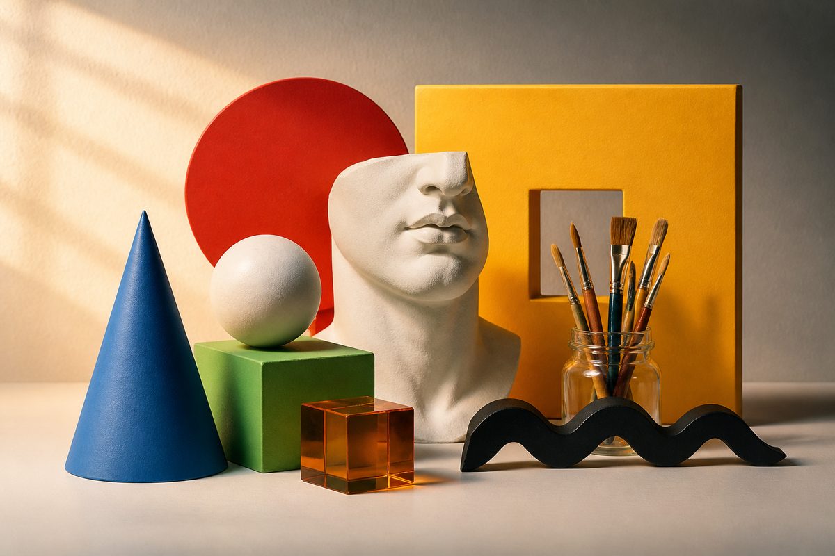
The seven main elements of art are line, shape, form, space, colour, value and texture. They're the basic visual ingredients an artist works with. A pencil sketch, a painting, a sculpture or a photograph: it makes no difference. Some teachers list a slightly different set, and a few add or drop an item. But these seven are the version you'll meet most in classrooms, galleries and art writing.
Think of them as the vocabulary of seeing. Once you can name them, you can describe what an artwork is doing and why it hits you the way it does.
This guide takes each element in turn, explains what it means in plain terms, and shows how they interact. It's written for students, curious gallery visitors and anyone who wants firmer footing when they look at art around Sunraysia and beyond. For more on the wider arts scene, see Sunraysia Arts Guide.
Elements Versus Principles: A Quick Distinction
People often mix up the elements of art with the principles of design. The elements are the raw materials, the things you can point to in an artwork. The principles, such as balance, contrast, rhythm and emphasis, describe how those materials are arranged.
Think of cooking. Flour, eggs and sugar are the elements. The recipe and the technique are the principles. This article sticks with the ingredients, though you'll see the arrangement creeping in. The elements rarely work alone.
Line: The Path of a Mark
A line is a mark that connects two points or follows a path. It can be thick or thin, straight or curved, smooth or jagged, solid or broken. Lines do more than outline things.
A horizontal line feels calm and stable. A vertical one feels upright and formal. A diagonal suggests movement or tension, and a loose, wavy line can feel playful or restless.
One of the most important kinds is the contour line. It traces the outer and inner edges of a subject to describe its form. Contour drawing is a standard exercise because it trains the eye to follow what's really there, not what you assume is there.
Lines can also be implied. When a row of figures all look in one direction, your eye follows an invisible line between them. Nothing has been drawn.
Shape: Flat Areas With Edges
A shape is a flat, enclosed area defined by a boundary. That boundary might be a drawn line, a change in colour or a change in tone. Shapes fall into two broad families.
Geometric shapes, such as circles, squares and triangles, feel ordered and deliberate. Organic shapes, such as the outline of a leaf, a pebble or a cloud, are irregular. They tend to feel natural and relaxed.
Shape is two-dimensional: it has height and width but no thickness. A painter can make a circle on a canvas look like a ball, but that trick belongs to the next element. Seeing shapes is also a handy habit for beginners. Squint at a scene and reduce it to flat patches. You'll judge proportions before you worry about detail.
Form: When Shape Gains Thickness
Form is what happens when a shape takes on a third dimension. Real forms, such as a clay bowl, a carved figure or a welded steel piece, exist in three-dimensional space. You can walk around them and touch them.
Illusory forms live in a drawing or painting. They're created on a flat surface using shading, perspective and overlap, so a circle appears to be a sphere.
Artists describe form with the same tools they use for other elements. A sculptor thinks about mass, volume and how light moves across surfaces. A painter fakes the same effect with careful steps from light to dark. When you stand in front of a sculpture and feel it change as you move, you're responding to form directly.
Space: The Area In, Around and Between
Space is the area an artwork occupies and the area within it. In a flat work, space is usually about distance: what feels near, what feels far and how much room is left for the eye to travel. In a sculpture or installation, space is literal. The viewer can move through it.
Artists have several ways to build the feeling of distance on a flat surface:
- Overlap: an object partly covering another reads as being in front of it.
- Size: smaller objects seem further away than larger ones of the same kind.
- Placement: items higher on the picture plane tend to read as more distant.
- Linear perspective: parallel lines appear to converge towards a vanishing point.
- Atmospheric effects: distant objects look paler, bluer and less detailed.
These tricks work because they borrow from depth perception, the way our eyes and brain judge how far away things are in daily life. The artist is persuading your visual system to see depth where there's only paint on a flat surface.
Positive and Negative Space
Space is also described by what's filled and what's empty. Positive space is the subject itself. Negative space is the area around and between subjects.
Negative space isn't leftover nothing. A well-judged empty area can give a subject room to breathe, create tension, or form a second, hidden shape.
A common classroom exercise is to draw the gaps around a chair instead of the chair itself. It often gives a more accurate result. Designers use the same idea when they leave generous margins to guide attention.
Colour: Hue, Saturation and Mood
Colour is the element most people notice first. It's usually described by three qualities. Hue is the name of the colour, such as red, yellow or blue. Saturation (sometimes called intensity) is how vivid or muted it is. The third quality, how light or dark it is, overlaps with the next element, value.
The colour wheel is the standard tool for organising hues. It arranges the primary colours (red, yellow and blue in traditional art teaching) with the secondary and tertiary colours that come from mixing them. The wheel makes it easier to talk about relationships:
- Complementary colours sit opposite each other and create strong contrast when placed side by side.
- Analogous colours sit next to each other and feel harmonious.
- Warm colours (reds, oranges, yellows) tend to advance and feel energetic, while cool colours (blues, greens) tend to recede and feel calmer.
These links are tendencies, not rules. Culture and personal experience also shape how we respond. And an artist can deliberately work against expectations. A tiny patch of intense warm colour in an otherwise cool landscape pulls the eye straight to it.
Value: Lightness and Darkness
Value describes how light or dark something is, whatever its hue. Convert a colour photograph to black and white and you'll see it: some areas turn pale grey, others near-black. A strong range of values gives an image drama and clarity. A narrow range gives it a quiet, misty feel.
Value is the main tool for building convincing form on a flat surface. Place a light area next to a dark one and the edge between them reads as a boundary. Blend gradually from light to dark across a circle and it starts to look like a ball lit from one side.
Artists often use the words tint, shade and tone to describe how colour and value work together:
- A tint is a colour with white added, making it lighter.
- A shade is a colour with black added, making it darker.
- A tone is a colour with grey added, making it more muted without changing its hue dramatically.
In everyday speech people use these words loosely. The distinction still helps when you're mixing paint and wondering why a mixture looks the way it does.
It also explains why a painting made of closely related tints can feel gentle, while one built from deep shades next to bright highlights feels theatrical.
Texture: The Feel of a Surface
Texture is the surface quality of a work or of the things shown in it. Actual texture can be felt: the rough grain of a woodcut, the thick ridges of oil paint, the smooth glaze of a ceramic bowl.
Visual or implied texture is an illusion. An artist paints or draws something so it looks rough, soft, glossy or spiky, even though the surface is flat and smooth.
Texture affects mood as well as realism. A heavily built-up surface can feel urgent and physical. A polished, seamless one can feel cool and controlled. Repeated texture also creates pattern, which adds rhythm to a composition. In printmaking, textile art and ceramics, texture is often the main attraction, not a supporting detail.
How the Elements Work Together
None of the elements operates in isolation. Change one and the others shift. A few examples show how closely they're tied:
- A line that thickens and thins gives the impression of weight and can suggest form.
- A shape filled with a gradient of value becomes a form.
- Cool, pale colours placed in the background help create space.
- Rough texture catches light unevenly, which alters value across the surface.
This is why art writers rarely discuss one element alone. A good description might note that confident contour lines define the figure, a limited palette of warm colours unifies the scene, and large areas of negative space give the composition a sense of calm.
Using the Elements to Look at Art
You don't need training to put the elements to work. Next time you're in a gallery, at a market stall or in front of a mural, try a simple routine:
- Start with a general impression, noting how the work makes you feel before you analyse anything.
- Find the most obvious element. Is it the colour, the bold lines, the texture or the sense of depth?
- Look for a second element that supports or contrasts with the first.
- Ask what the artist achieved by emphasising those choices. What would change if the palette were different, or if the empty areas were filled in?
This turns passive looking into active reading. It also gives you a shared language for talking about art with friends, children or fellow visitors. No specialist terms needed.
Using the Elements to Make Art
The same framework works for makers. If a drawing feels flat, check your value range. Did you use overlap and size to build distance? If a painting feels chaotic, try limiting your palette to a few related hues from the colour wheel. If a composition feels crowded, open up some negative space.
Treat the elements as a checklist of levers. Problem-solving gets less mysterious, because you can adjust one at a time and see what changes.
Many teachers encourage short exercises on a single element: a page of line types, a collage using only shapes cut from paper, a monochrome study using only values from white to black, or a rubbing collection to explore texture. Small, focused studies like these build awareness faster than trying to master everything in one finished piece.
Why Different Lists Exist
Search around and you may find lists with other items, such as pattern, mass or movement. Others have five or six entries. There's no single official version. Different textbooks, curricula and traditions have settled on slightly different sets, and some treat shape and form as one idea or fold value into colour.
The seven listed here are the most widely taught, and they cover nearly everything else. Pattern, for example, is just repeated line, shape, colour or texture. What matters isn't memorising an official count. It's being able to see and name the building blocks of a work.
Bottom Line
The seven elements of art are line, shape, form, space, colour, value and texture. Learn what each one does, notice how they combine, and you'll find it much easier to understand why an artwork succeeds, to describe it clearly, and to make better choices in your own work. Start with one element at a time. Practise spotting it in everyday surroundings, and the rest follows with time.