What Are Four Characteristics of Visual Art?
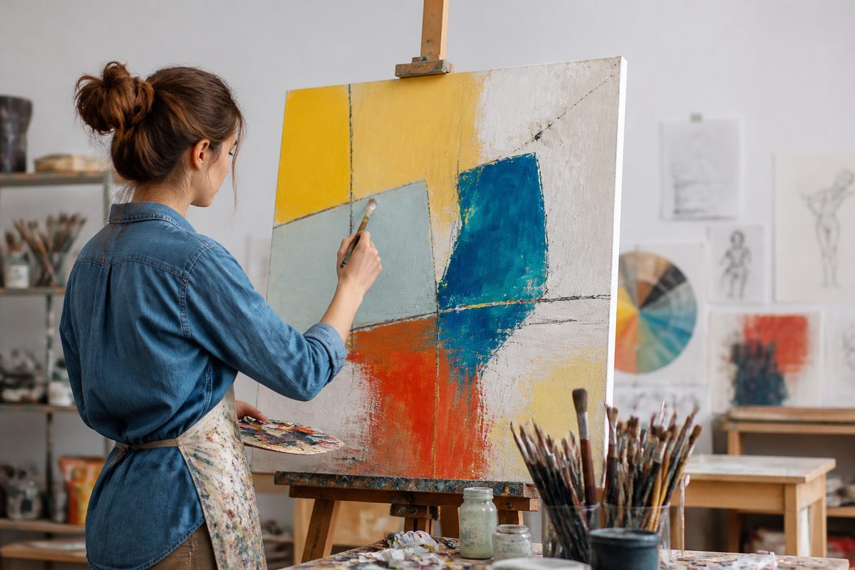
Four defining characteristics of visual art are visual form, creative intention, medium and technique, and interpretation by an audience. Together they separate a work made to be looked at and understood from an object that's only functional or decorative. No single list is official, and teachers and critics group the ideas differently. But these four cover most of what people mean when they call something art you experience through sight.
This guide takes each characteristic in turn. It shows how to spot it in a real work, and how the four interact. Ever stood in front of a painting, sculpture or photograph and wondered what you were supposed to notice? The framework below gives you a place to start.
For more on exhibitions, studios and creative life across the region, Sunraysia Arts Guide is an independent editorial resource.
Why a Short List Helps
The term visual arts is broad. It takes in drawing, painting, printmaking, sculpture, ceramics, photography, textiles, installation and many hybrid forms. A set of characteristics is handy because it works across all of them.
A watercolour landscape and a welded steel sculpture look nothing alike. Yet you can talk about both the same way: how they're built, why they were made, what they're made from and how people respond to them.
Think of the four characteristics as questions you can put to any work. What do I see? What was the maker trying to do? How was it made? What does it mean to me and to others? Those questions turn passive looking into something closer to reading.
Characteristic One: Visual Form
The first and most obvious characteristic is that visual art speaks through what the eye can see. Its raw materials are visual qualities, usually called the elements of art. Most beginner courses name seven: line, shape, form, space, colour, value and texture.
Artists mix these elements. Then they organise them using principles such as balance, contrast, rhythm, proportion and emphasis.
Line and Contour Line
Line is the simplest element and one of the most expressive. A line can be thick or thin, smooth or jagged, calm or agitated. A contour line follows the outer edge of a subject, or traces the edges of its inner features, to show its outline and volume.
A single unbroken contour drawing of a hand can suggest weight and structure with very little detail. Line also leads the eye. It pulls a viewer from one part of a work to another.
Shape and Form
Shape is a flat, enclosed area, such as a circle, a rectangle or an irregular patch. It can be geometric and tidy or organic and loose. Form is the three-dimensional cousin of shape: where a shape is flat, a form has height, width and depth.
A sculptor works directly with form. A painter uses shading and perspective to make a flat shape look solid.
Colour and the Colour Wheel
Colour shapes mood faster than almost any other element. The colour wheel is the standard tool for making sense of it. It lays out hues in a circle so relationships show up. Neighbouring hues create harmony. Opposites on the wheel, called complementary colours, make vibrant contrast side by side.
Artists also adjust value (how light or dark a colour is) and saturation (how intense it is). Warm colours often feel energetic and close. Cool colours feel calm and distant, though context always matters.
Space, Depth Perception and Three-Dimensional Space
Space is the area around, between and within things. Artists working on a flat surface have to fake depth, and they do it by borrowing from depth perception, the way our brains judge distance in everyday life. Overlapping objects, smaller sizes for distant things, converging lines, softer detail and paler colour in the background all signal distance.
A sculptor, by contrast, fills real three-dimensional space and invites viewers to walk around the work. The shape changes with every angle.
Texture and Value
Texture is the surface quality of a work. It can be real (the ridges of thick paint, the grain of timber) or implied (a drawn illusion of rough bark). Value, the range from light to dark, builds volume, drama and focus. A high-contrast image feels sharp and urgent. A narrow, soft range feels quiet.
Visual Hierarchy
Once the elements are in play, the artist decides what the viewer sees first, second and last. This ordering is visual hierarchy. A bright patch against a muted background, a large figure among small ones, or a strong line pointing toward a subject all set emphasis.
Without hierarchy, a work can feel flat or chaotic. With it, a viewer is guided through the image, even if they never notice.
So the first characteristic boils down to this: visual art is built from deliberately arranged visual elements.
Characteristic Two: Creative Intention
The second characteristic is purpose. Visual art is made with some intention, even if it's hard to put into words. An artist may want to record a place, express a feeling, question a belief, explore an idea or just see what happens when two colours meet.
The motive doesn't need to be grand. What matters is that the arrangement of the visual elements is a choice, not an accident.
Intention also helps tell art from similar things. A stained wall may have beautiful colour and texture, but unless someone selected, framed or shaped it, there's no creative decision behind it. Likewise, a mass-produced poster and a hand-printed linocut might share a subject. The linocut carries the visible evidence of a maker's decisions at every stage.
Intention Does Not Fix Meaning
Knowing the artist's aim can deepen understanding, but it's not a final verdict. Artists sometimes explain their work in a statement. Sometimes they decline to. Sometimes they find meanings after the fact.
Viewers are free to find things the maker never planned. That's why intention is a characteristic of the making, not a rule for the looking. It sits alongside the fourth characteristic below rather than overruling it.
Intention in Different Traditions
Purposes vary widely across cultures and periods. Some works were made for ritual or storytelling, some to commemorate people or events, some for private reflection, and some to challenge convention. Knowing the original setting can change how you read the visual choices.
A tradition that values symbolism over realism, for example, will use colour and shape quite differently from one that prizes lifelike description.
Characteristic Three: Medium and Technique
The third characteristic is that every visual artwork is made from something, physical or digital, and the way it's handled leaves a trace. The medium is the material. The technique is the method of working it. Choices here are never neutral, because each material has its own behaviour and character.
Take oil paint. It dries slowly, so an artist can blend colours smoothly on the canvas, rework passages over days and build up glowing layers. It can also go on thick, so brushstrokes stay visible as texture.
Watercolour, by comparison, is transparent and unforgiving. The artist often saves the white of the paper for highlights and has to work quickly and with confidence. Charcoal gives soft, smudgeable tone. Ink favours crisp, decisive line.
Mediums Beyond Paint
Visual arts stretch well past painting and drawing. Printmaking transfers an image from a prepared surface, which brings repetition and subtle variation. Ceramics turns clay into lasting form through shaping and firing. Photography records light, whether through a film camera or a digital sensor.
Textile work builds image and pattern through thread and weave. Digital art uses software and screens. Installation can combine objects, sound, light and architecture into one environment.
Skill and Process
Technique is the visible evidence of skill and decision-making. It may be polished and precise, or deliberately rough. Neither is automatically better. A loose, gestural brushstroke can be just as controlled as a finely blended surface, because the artist knows the effect they're after.
Look closely at how a work was made. Can you see the pencil underdrawing, the tool marks in clay or the layering of ink? That often tells you more about its character than the subject alone.
Why the Medium Shapes Meaning
The material is part of what the work says. A portrait carved in stone speaks of permanence. One sketched in a few quick lines speaks of immediacy. Recycled materials can underline a theme about waste, and delicate thread can suggest fragility.
When you ask why this material? you often get closer to the idea behind the piece.
Characteristic Four: Interpretation and Response
The fourth characteristic is that visual art invites a response. It's made to be seen, and it only finishes its work when someone looks, reacts and thinks about it. Two people can stand in front of the same painting and walk away with different readings. Both can be defensible, because each brings their own memories, culture and mood.
Interpretation usually draws on three layers. The first is description: what's actually there? The second is analysis: how are the elements arranged, and what effect does that arrangement have? The third is judgement and meaning: what do I think the work is saying, and how well does it do it?
Moving through these layers in order keeps opinions tied to evidence from the work itself.
Context Adds Depth
Where and when a work was made, who made it and for whom all shape meaning. A landscape painted to document a place at a certain moment reads differently from one invented from imagination. Knowing the context doesn't remove the need to look. It just sharpens what you notice.
Emotion Counts
A gut reaction is a fair starting point. Unease, delight, curiosity or boredom each tell you something about how the visual elements are working on you. The skill is in tracing the feeling back to its source. Maybe a harsh diagonal line, a crowded foreground or a surprisingly warm patch of colour.
How the Four Characteristics Work Together
The characteristics aren't separate boxes. They lean on one another in every work. Intention drives the choice of visual form. The medium limits and shapes which forms are possible. And the audience's response depends on all three.
Picture it as a loop. The artist decides what to say, uses a material and technique to build a visual structure, and the viewer reads that structure and feeds meaning back into the work.
Here's a short example. Imagine a still life of a bowl of fruit painted in oil paint. The visual form includes rounded shapes, a warm palette drawn from one side of the colour wheel, and a pale background to push the bowl forward. The intention might be to study how light falls across different surfaces.
The medium, with its slow drying time, allows soft shifts between light and shadow. And a viewer may respond by feeling calm, or by recalling a family kitchen, or by admiring the craft. All four characteristics are active. Take away any one and the painting changes.
Using the Framework When You Look
You don't need special training to apply these ideas. Here's a simple routine for any gallery visit or studio open day.
- Look before you read. Spend at least a minute with the work before checking the label. Note where your eye lands first, which is the visual hierarchy at work.
- Name the elements. Identify the dominant line, shape and colour. Ask whether the space feels shallow or deep, and how the artist achieved that through depth perception cues or real three-dimensional space.
- Guess the intention. Ask what the maker might have wanted you to feel or consider, then compare your guess with any statement provided.
- Examine the making. Look for brushstrokes, tool marks, layers or seams. Ask why this medium suits the idea.
- Record your response. Write one sentence about what the work means to you and one about what in the work caused that reaction.
Try it a few times and it becomes automatic. It makes even unfamiliar styles easier to approach.
Common Misunderstandings
Art Must Look Realistic
Realism is one approach among many. Abstract, expressionist and symbolic works are built from the same elements and shaped by the same four characteristics. No recognisable subject doesn't mean no skill or intention.
Beauty Is the Test
Visual art can be unsettling, awkward or confronting. Its value lies in how well it communicates and engages, not only in whether it's pleasant. Many significant works were thought ugly by early audiences.
Only Famous Mediums Count
Craft-based practices such as ceramics, weaving and glasswork meet every characteristic described above. The old divide between fine art and craft has softened a lot, and many contemporary artists move freely between them.
There Is One Correct Reading
Because interpretation is a defining characteristic, a work rarely has a single right answer. Some readings are better backed by the visual evidence than others. But many possible meanings are part of what makes art worth revisiting.
Why These Characteristics Matter Beyond the Gallery
Understanding what makes visual art what it is has practical payoffs. It makes you a more confident viewer, better able to talk about work with friends, artists and gallery staff. It helps buyers work out what they respond to.
It gives students a vocabulary for analysing images, and it helps makers reflect on their own decisions. Visual literacy also carries into daily life, from reading design and signage to seeing how images shape opinion.
Bottom Line
The four characteristics of visual art discussed here are visual form, creative intention, medium and technique, and interpretation. Visual form covers the elements of art and how they're organised. Intention explains why the choices were made. Medium and technique give the work its physical or digital reality. Interpretation completes the circuit by putting the work in front of a thinking, feeling audience.
Learn to ask what you see, why it was made, how it was made and what it means. Almost any work becomes easier to understand and more rewarding to look at.