How Can I Make My Exhibition More Interesting?
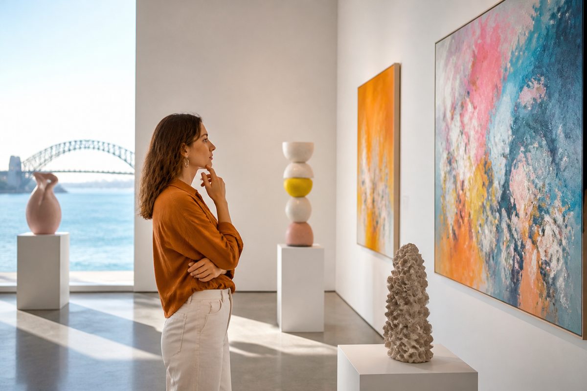
Make your exhibition more interesting by giving visitors one clear idea to follow, a reason to look closely at each work, and something to do or feel along the way. Most flat exhibitions don't lack good work. They lack a through-line, a sense of pace and a few moments that invite people to join in rather than walk past.
This guide focuses on the choices you can make in the room itself. It suits a community gallery show, a school display, a pop-up in a vacant shopfront or a stand at a Sunraysia Arts Guide style regional arts event.
Start With One Idea, Not a Collection of Objects
An exhibition gets interesting when visitors can answer a simple question on the way out: what was that about? If the honest answer is "a lot of nice things", the show will blur together in memory. Even if each piece is strong.
Try to write your central idea as a single sentence before you hang or place anything. It might be a question ("What does home look like when you have moved three times?"), a tension ("handmade versus mass-produced") or a simple lens ("the river through four generations of local artists").
Everything in the room should either support that sentence or go.
This is where discipline pays off. Cutting a third of the work often makes the rest more interesting. Each piece gets room to be seen, and the visitor isn't asked to take in more than they can hold.
Think Like a Visitor Moving Through Time
A visitor doesn't experience your show as a floor plan. They experience it as a sequence: an arrival, a few minutes of curiosity, a middle where attention can sag, and an ending that either lands or fizzles. Good exhibit design treats that sequence as a story with a beginning, a middle and an end.
Create a strong opening
The first thing a visitor sees sets expectations. Place your most arresting piece, or a short, confident statement of the idea, where it can be seen from the entrance.
Don't open with a wall of introductory text. People rarely read it at the door, and it signals that the show is homework.
Vary the rhythm
If every wall has the same spacing, scale and lighting, the eye stops noticing difference. Mix large and small works. Mix dense clusters with single pieces that have generous space around them.
A pause, such as one small object alone on a plinth, makes the crowded wall after it feel more energetic.
Plan the ending
Finish with something that rewards the journey: a strong final work, a place to leave a response, or a quiet corner for reflection. Visitors remember endings far more than middles. So don't trail off into a corridor or a stack of storage boxes.
Use Design to Direct Attention
Good design is mostly about deciding what people look at first, second and third. You don't need a big budget to do this well. You need to be deliberate.
- Lighting: Light the work, not the room. Even modest spotlights or adjustable lamps create contrast that draws the eye. Avoid glare on glass and shiny surfaces.
- Colour: A painted feature wall or a considered colour behind a group of works can tie them together and set a mood. Keep the palette limited so the artwork stays the star.
- Height and spacing: Hang work so its centre sits at a comfortable eye level for most adults. Consider a lower line for children or wheelchair users where the content suits them.
- Grouping: Put works in conversation. Two pieces that echo or clash with each other spark more thought than the same pieces on opposite walls.
- Sightlines: Let visitors glimpse what's coming next through a doorway or gap. Curiosity pulls people forward.
Write Labels People Actually Read
Labels are often the weakest part of an otherwise good exhibition. They're too long, too technical or too alike. A few changes lift them a lot.
- Lead with something a visitor can use: what to look for, a surprising detail or the story behind the making.
- Keep most labels short. Save longer texts for a handful of key works or an introductory panel.
- Use plain language. If a term needs explaining, explain it in a few words rather than assuming people know it.
- Use a legible type size and strong contrast, and place labels at a height that's easy to read.
- Write in the voice of the show. A playful exhibition can have playful labels. A sombre one shouldn't.
Try adding a question to some labels, such as "What do you notice about the colour of the water?" Questions turn passive viewing into active looking.
Add Interaction That Serves the Idea
Interaction makes exhibitions memorable, but only when it ties to the content. A touch station with nothing to do with the theme is just a distraction. Ask what a visitor would truly understand better by doing rather than reading.
Low-cost, low-tech options
- A response wall where visitors write or draw an answer to a prompt.
- Sample materials to handle, such as clay, fabric, pigment or timber, next to the finished work.
- A simple "vote" using stickers or tokens on a question related to the theme.
- A making table where visitors can try a basic version of a technique shown in the exhibition.
- A trail or checklist for children that sends them hunting for details in the work.
Where technology helps
Used with restraint, technology can add layers without crowding the walls. The best uses give visitors a choice. Those who want more can go deeper, and those who prefer to look quietly aren't forced to engage.
- QR code: A printed QR code beside a work can link to a short video of the artist at work, a longer text, a sound clip or a translation. It keeps labels short while offering depth. Make the code big enough to scan easily, test it on the venue's mobile coverage, and offer a printed alternative for visitors without a phone.
- Audio tour: A simple audio tour, whether on borrowed devices or through visitors' own phones and headphones, lets you add the artist's voice, local stories or descriptions without cluttering the room. Keep each track short, ideally one to two minutes, and number the stops clearly. Audio descriptions can also help visitors with low vision.
- Augmented reality: Augmented reality can animate a work, show how a piece was made, or reveal a historical layer over a present-day view. It can be striking. But it asks more of visitors and of your setup. Test it on a range of devices and make sure the show still works without it.
- Projection mapping: Projection mapping, which fits projected images precisely onto objects, walls or sculptural surfaces, can turn a plain form into a moving canvas. It works best as one or two focused moments rather than a constant presence. It also needs a darkened space and reliable equipment.
Whatever you choose, plan for when it fails. Devices crash, Wi-Fi drops and projectors overheat. A show that depends on one piece of technology is fragile.
A show where technology is an optional extra stays interesting even on a bad day.
Protect Your Visitors From Museum Fatigue
Museum fatigue is the mental and physical tiredness that builds as visitors move through a large or dense display. It shows up as faster walking, skimming and, in the end, leaving. Even small exhibitions can cause it if the content is relentless or the space is uncomfortable.
You can reduce it in practical ways:
- Offer a rest area. A bench, a few chairs or a cushioned corner gives people a place to pause, talk or look again. Put seating where there's something worth looking at, such as facing a strong work or a window. Then rest becomes part of the experience, not an interruption.
- Break up the content. Alternate intense sections with lighter ones. A quiet room, a change in colour or a shift in medium resets attention.
- Limit the number of messages. Each room or zone should carry one main idea, not several competing ones.
- Control noise and temperature. Echoing rooms, overlapping audio and uncomfortable temperatures wear people down faster than any amount of text.
- Make the route clear. Visitors who aren't sure where to go next spend energy on finding their way instead of on the work.
Bring People Into the Room
An exhibition is more interesting when it feels like an event, not a static display. Programming around the show gives people reasons to visit and to return.
- Artist talks and walkthroughs: Hearing the maker describe a decision often changes how people see the work.
- Workshops: Hands-on sessions suit families, schools and community groups, and give people a personal stake in the theme.
- Guided tours: Volunteers or staff who enjoy talking with visitors can lift the whole atmosphere. A short briefing on the exhibition's key ideas helps them answer questions with confidence.
- Quiet sessions: Some visitors, including those who are sensitive to sensory input, will appreciate set times with lower noise and lighting.
Check the details of any program before you promise it. And keep the offering realistic for the people and time you have.
Adapt the Approach to the Setting
The right tactics depend on where the exhibition is shown and who's likely to see it.
Gallery and community venues
Visitors usually come with time and some intent. You can afford longer-form content, quieter spaces and subtle layering. The main risk is predictability: rows of framed work at the same height, all labelled the same way.
Pop-ups and shopfronts
Passers-by decide in seconds whether to step inside. Put your boldest work in the window, keep signage simple and make the entry feel easy. Inside, keep the route short and the content punchy.
Trade show and fair stands
At a trade show, you compete with dozens of other displays for a few seconds of attention. Lead with a strong visual or a single clear question, and keep text minimal. Give people something to do, such as sampling a material, watching a short loop or scanning a QR code to take the story with them.
Staff who greet visitors warmly, without hovering, make a surprising difference.
Schools and youth shows
Involve the participants in the display itself. Students who help write labels, choose groupings or lead tours bring energy that visitors can feel. Interactive trails and prompts keep younger audiences engaged.
Make It Accessible, and It Gets More Interesting for Everyone
Access is often treated as a box to tick, but its effects reach every visitor. Clear sightlines, readable labels, comfortable seating, good lighting and step-free routes all make an exhibition easier to enjoy.
Offering several ways to engage, such as text, audio and touch, means more people can connect with the work in the way that suits them. Check local access guidance and, where possible, ask people with lived experience to test the layout before opening.
Test, Watch and Adjust
You don't need to get everything right before opening. Treat the first days as a test. Stand quietly at the edge of the room and watch what visitors do.
- Where do people slow down, and where do they speed up?
- Which labels are read and which are ignored?
- Do visitors find the interactive elements without being told?
- Where do they stop, hesitate or turn back?
A short comment card or a single question at the exit, such as "What is one thing that stayed with you?", gives useful feedback without feeling like a survey.
Small fixes, such as moving a bench, rewriting a label or adjusting a light, can change how a room feels within a day.
A Quick Checklist Before You Open
- Can you state the central idea of the show in one sentence?
- Is there a strong first view from the entrance?
- Does the layout vary in scale, spacing and pace?
- Are labels short, clear and legible?
- Does every interactive element connect to the theme?
- Does any technology you use have a backup if it fails?
- Is there a place to sit and rest?
- Is the route obvious, and does the show end well?
- Have you tested access, lighting and sound?
Bottom Line
An interesting exhibition is rarely the result of one spectacular feature. It comes from a clear idea, thoughtful sequencing, readable labels, a few well-chosen moments of participation and a comfortable space that respects how much a visitor can take in.
Start with what you want people to understand or feel. Then edit ruthlessly and add only the layers that serve that aim. Whether you use a handmade response wall or a carefully tested layer of technology, the goal is the same: give visitors a reason to look longer than they planned.